What are the potential costs, and what’s the potential impact?
You might back the wrong horse if you don’t assess these risks and impacts properly.
The initiatives you put in place won’t have the intended impact and could cost more than you bargained for.
Tornado diagrams provide a simple way to visualize risk and reward.
Let’s explore what a tornado diagram is and how it helps you assess impact. We’ll explain how to create your own and where to use them in your business.
What’s a tornado diagram?
A tornado diagram is a visual tool used to measure risk and impact.
The tornado shape indicates how risky or impactful something is. The longer the bar on the tornado diagram, the more sensitive the outcome is to that variable.
Often used in project management and risk analysis, these diagrams help you measure both positive and negative impacts to see how they’ll affect a project as a whole.
Tornado diagrams are also used in sensitivity analysis. Sensitivity analysis is simply a way to play “what if” by changing the value of one variable at a time to see how much those changes affect the entire business outcome.
How to read tornado diagrams
The vertical axis (Y axis) lists the variables you want to measure for impact and risk.
The horizontal axis (X-axis) shows the impact type — whether time or money. (It’s usually money).
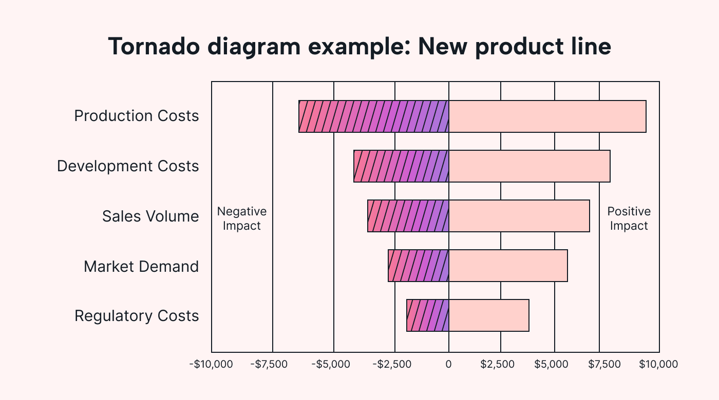 |
On the X-axis, zero is in the middle.
The negative impact is to the left, and the positive is to the right.
Essentially, the left-hand side shows how much risk the variable carries, and the right-hand side shows the reward.
Variables with an even spread left and right have a balanced risk-reward ratio. Variables that skew to the left have higher risks than rewards, and vice versa.
You organize variables by bar length, with the longest up top. The further the bars spread left and right, the more sensitive a variable is.
Since the biggest bar goes up top (and the shortest on the bottom), you get a tornado shape.
This easy-to-read format shows you which variables to prioritize. The higher a variable is on the tornado, the more sensitive risks/impacts are.
What's a tornado diagram in risk analysis?
In risk analysis, a tornado diagram evaluates the potential impact of different variables on a project to determine the biggest risks.
Organizing information in this digestible manner makes it easier to visualize how different factors might influence a project’s success or failure.
The further the bar reaches the left, the riskier it is.
The tornado shape helps teams prioritize risks. If a variable poses a high risk and low positive impact, address these risks first.
Additionally, tornado diagrams help you understand how addressing one risk affects another.
Let’s look at an example…
Imagine you’re analyzing the risks of a construction project.
Your tornado diagram might list factors like ‘completion time,’ ‘material costs,’ and ‘labor availability.’
Let’s say you secure a bargain fixed-price contract for materials.
Since there’s less risk of financial impact here, this changes the variable so the “material costs” bar gets shorter.
But it also affects other variables.
Now that you’re spending less on material costs, you can allocate a higher budget to labor. This reduces the risks around project completion time and labor availability.
What’s a tornado diagram in cost-effectiveness analysis?
In cost-effectiveness analysis, a tornado diagram assesses the financial factors of a project.
It weighs up costs, like material, labor, and operational expenses, against potential outcomes like sales volumes and profit margins.
These tornado charts can help project managers understand how changing budgets can affect outcomes and vice versa.
For example, your operational costs are at the top of your tornado, and your profit margin is lower.
You want to focus on reducing operational costs to boost your profit margin.
You switch to an AI task management system. This reduces operational expenses and labor costs as there’s far less admin work.
But imagine you have a sudden increase in sales volume.
Now, labor costs shoot up the tornado diagram, as you need more people to cover more manufacturing shifts.
But, since you’re selling more, you can buy materials in bulk.
You’d use the chart to understand how much lower material costs must be to cover extra labor costs.
In this sense, tornado analysis is crucial for cost modeling. It helps you determine where to allocate finances to have the highest impact.
How to use tornado diagrams to manage risk: 8 actionable examples
Here are some of the most effective ways to use tornado diagrams to manage critical factors and confidently make business decisions.
1. Plan project budgets
Use tornado diagrams to plan your project budget.
They help you visualize how different budgetary items, like materials, labor, and equipment costs, affect each other.
It’s a simple forecasting technique to help you gauge the dependent variables that affect financial returns. This makes it easier to build a financial model for your project.
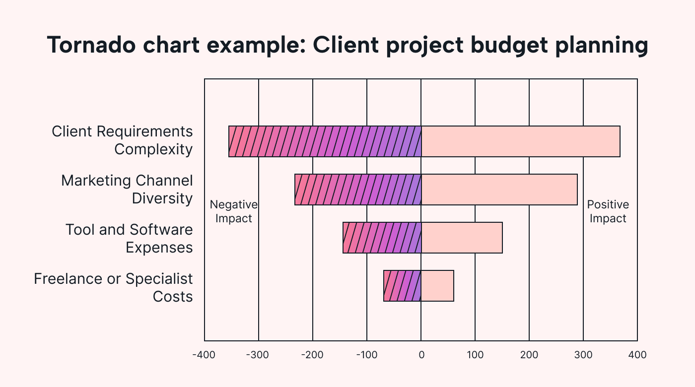 |
Imagine you're running an interior design agency.
You need to figure out the budget and scope for a client project.
You can see which cost variables might impact project costs most.
You work out that if the client wants high-quality materials, you’ll need to cut back labor costs. But, this will increase project time.
If the client wants a finished product quickly, they might have to settle for lower-quality materials (the lead time is too long on higher quality materials) or pay a higher price to cover the labor.
2. Identify key risks
To manage levels of risk, you need risk analysis techniques that compare each critical variable to understand its potential impact.
A tornado diagram acts like a risk mapping tool. You can see which risks are the biggest and which to handle first.
For instance, say you're planning an outdoor festival.
A tornado diagram shows you how much things like bad weather, drinking water availability, and vendor reliability could affect your plans.
Attendees might be fine getting wet in the rain, but they will leave if the water runs out. Fix the water issue first.
3. Manage project schedules
Tornado diagrams can show how variables impact your time.
They help you see what might cause delays, like staff availability, staffing volumes, or stakeholder approval.
 |
For instance, a graphic design company might think they’re experiencing delays because they don’t have enough staff.
But, after tornado chart analysis, they find that poor scheduling has a bigger impact.
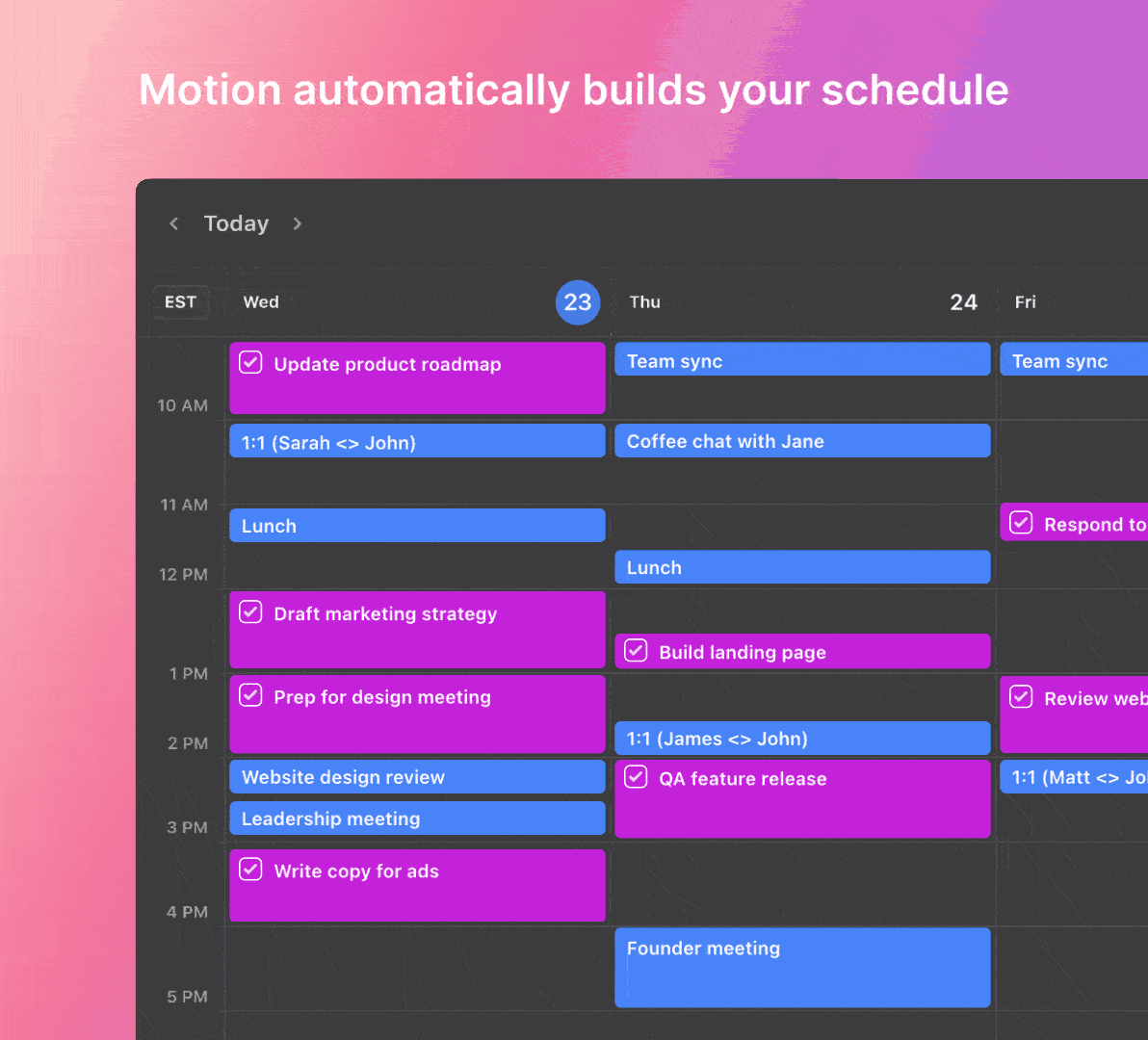
Instead of hiring more team members, the company switches to Motion to streamline staff schedules to minimize the risk of delays from manual scheduling.
4. Optimize resource use
Tornado diagrams show you where to use your resources wisely.
By altering variable values on your diagram, you can see how these changes impact overall project outcomes.
For example, you might adjust the number of workers on your project to understand how this would affect project timelines and costs.
Or, you might consider how an investment in equipment could affect completion time.
5. Assess market trends
Use a tornado chart to understand how market changes impact your business.
Weigh up the risks and impacts of trends, preference shifts, competition, and supply chain reliability.
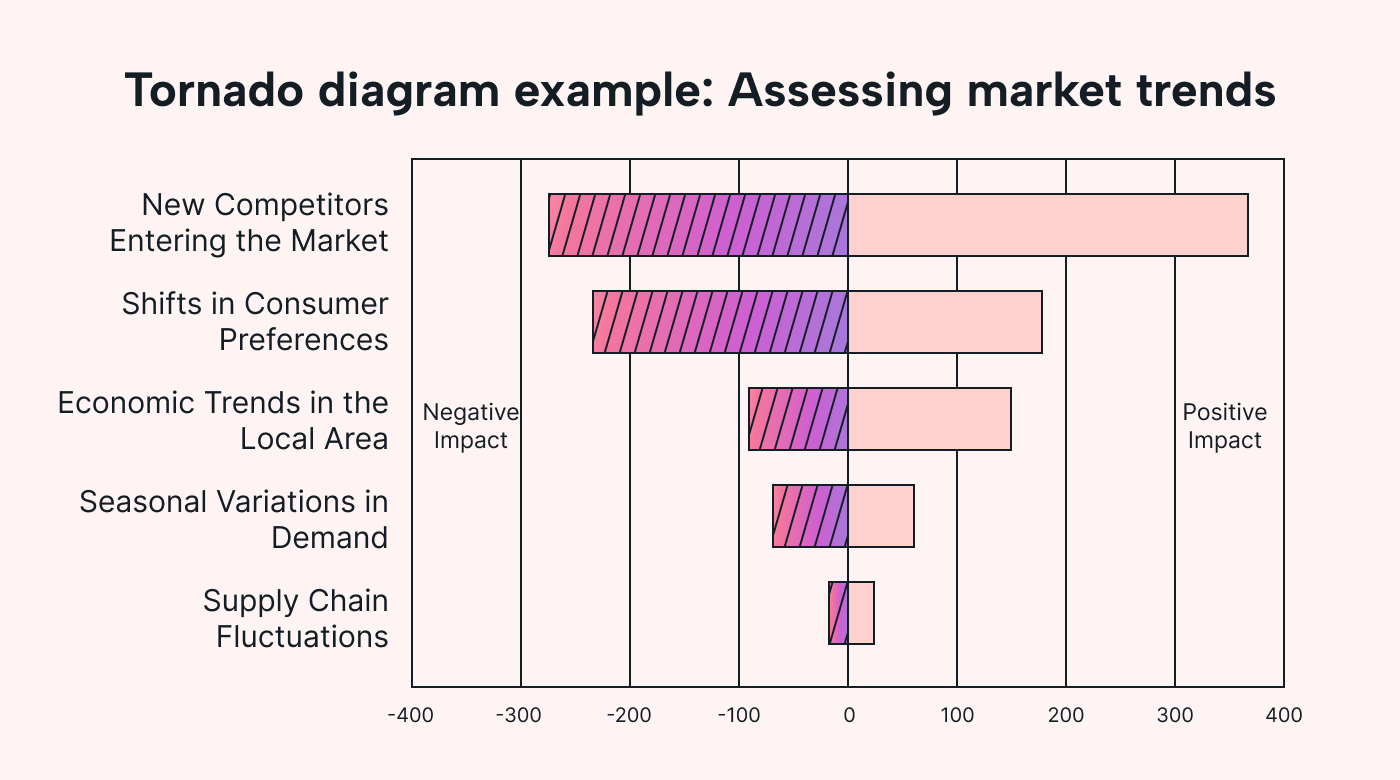 |
For example, imagine you run a local cafe with a big-name coffee chain opening close by.
You might examine how competitors' prices, menu options, and opening hours affect customer loyalty.
6. Improve supply efficiency
To improve supply chain costs and efficiency, use a tornado diagram to compare how outgoings affect output.
For instance, a local bakery is famous for its fresh bread. But when the bread isn’t fresh, customers don’t buy it.
The bakery considers the cost/impact of changing suppliers on ingredient availability.
Shortening delivery times increases supplier costs. But it also boosts sales volumes.
Do sales volumes increase more than supplier costs? If so, switching to a more expensive supplier with shorter delivery times makes sense.
7. Forecast customer needs
Tornado charts can show you how customer demand influences different factors.
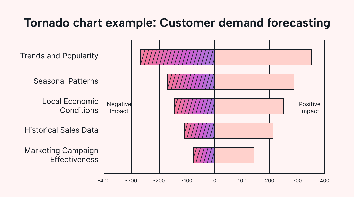 |
Picture a clothing boutique preparing for the winter season.
The diagram shows an especially long ‘seasonal patterns’ bar compared to a relatively short ‘trends and popularity’ bar.
This indicates that, during the winter, it's more important to stock seasonal items over trendy fashion lines.
8. Guide new product development
Tornado diagrams can help to decide what’s practical when developing a product.
Let’s imagine a craft brewery is considering new beer flavors.
The tornado diagram shows a long bar for ‘market appeal,’ but ‘product diversity’ is short.
This shows that product success hinges on consumer preference over number of choices.
The brewery decided to test the market by picking a few popular flavors rather than releasing many different products.
How to plot a tornado chart: Step-by-step
Now that you understand how tornado charts work, let's learn how to plot them.
Follow these four steps…
1. Identify key variables
List the project factors that could impact the outcome you’re testing.
For instance, say you want to know what affects profit margins. You pick variables that cost money and make money.
Alternatively, you’re considering what impacts time. You’d look at what factors eat up your time and which save you time.
Select the ones most likely to have the greatest impact. Picking too many variables clutters the diagram.
2. Collect data for variables
Gather data on your variables. This could be historical customer data, expert opinions, or market research.
You must verify this data. Inaccurate data gives unreliable results.
Set realistic ranges (minimums, maximums and expected values) for the diagram spread.
3. Create the diagram layout
Choose your tools. You might use a simple spreadsheet or specialized statistical analysis software.
Set up the impact range on the horizontal axis and the variables on the vertical axis.
Input the data for each variable. Your tool will create bars to represent the impacts of each variable.
Organize the variables to list in decreasing order to create the tornado shape.
4. Interpret and analyze the diagram
Assess the impact and make decisions.
Remember, the most sensitive variables are at the top.
If a variable is high-risk/cost or low, high impact skews left.
If it’s low-risk/cost, high impact, it skews right.
If it’s equal both ways, there’s a balanced risk-to-reward ratio.
What are the benefits of a tornado diagram?
Want to make better decisions around risk and impact? Tornado diagrams help. Here’s how.
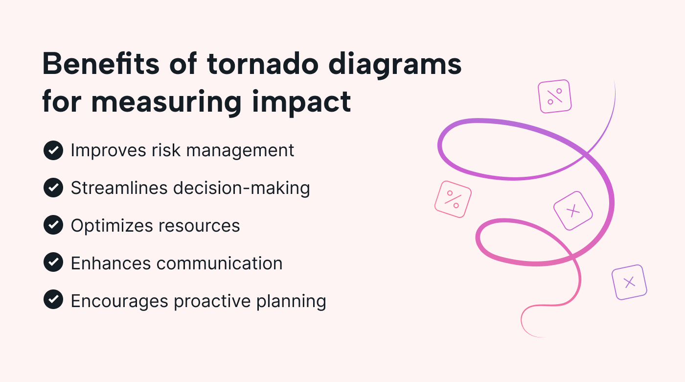 |
Improved risk management
Tornado diagrams make it easy to assess risk and impact.
The tornado shape clearly shows which risks are most significant. This way, teams can prioritize risk management efforts to reduce vulnerability.
For instance, picture a family-run restaurant. It’s considering whether it should expand its dining area or invest in a delivery service.
It uses a tornado diagram to visualize potential revenue and customer flow impacts.
This helps them make a less risky decision.
Enhanced decision-making
Tornado diagrams allow you to leverage quantifiable data rather than intuition.
You can predict outcomes by comparing and adjusting the diagram to consider different scenarios. This helps you make more informed decisions.
Better resource allocation
Reduce waste and prevent resource bottlenecks.
Use tornado diagrams to identify where resources are needed most.
This way, you reduce over-allocation and under-utilization.
Facilitates effective communication
Tornado diagrams are easy to understand. This simplifies complex risk analysis so everyone’s on board.
For example, a product design agency might use tornado diagrams in client meetings. They’re a great visual cue to show how different material choices impact project costs and timelines.
Encourages proactive planning
Tornado charts help you pinpoint potential challenges so you can prepare for them.
These charts show you which factors might have the largest impact on project and business success.
Teams can prioritize contingency plans to manage the most significant risks.
Tornado diagram challenges and limitations
Tornado diagrams are limited by three main factors:
- Accurate data: Inaccurate, outdated data leads to misleading results. Garbage in, garbage out.
- Interpretation skills: If your team can’t read tornado charts properly, they’ll come to the wrong conclusions.
- Visual clarity: Too many factors spoil the broth. Pick the main variables, as it’s hard to read tornado charts with too many factors.
Simplify risk management
Tornado diagrams are a user-friendly way of visualizing risks and impacts. This helps you make project and business decisions to prioritize your efforts and resources.
If your most significant risk is time management, remember tools like Motion can help streamline this element of your project.
AI-driven intelligent scheduling optimizes your time and ensures your projects stay on track.
Try Motion for free to see how smart scheduling helps you make the biggest impact in the shortest time.


