
Overseeing a team and keeping its projects on track is no easy task.
Once you’re in the thick of a project, it can be difficult to gain a clear perspective on how the work is going and how to move forward.
Enter the burndown chart — a simple visual that offers immediate insights into a project’s status.
You’ll need to know how this visual works before you can tap into its insights. In this article, we tell you what a burndown chart is, give you clear steps on how to make one, and tell you exactly how to put one to good use for your company.
What is a burndown chart?
A burndown chart is a visual tool that depicts the amount of work remaining in a project, as well as the amount of time left to complete it.
In other words, it’s a project management tool that provides teams with a visual representation of their projects. It shows the team’s progress in relation to the deadline.
The beauty of a burndown chart is that it’s simple and direct but also powerful. It is instrumental in decision-making, as it allows teams to adjust:
- Timelines
- Resource allocation
- Project scope
That’s because teams can see when they’re on track and what they need to do to catch up if they’re not.
How does a burndown chart work?
Here’s how the chart breaks down. First, there are two primary axes:
- X-axis: This marks the passage of time. The timeline could be days, weeks, or even months, depending on the scope of the project.
- Y-axis: This quantifies the amount of work remaining. You can represent it in various units, like tasks, hours, or the more Agile-centered “story points.”
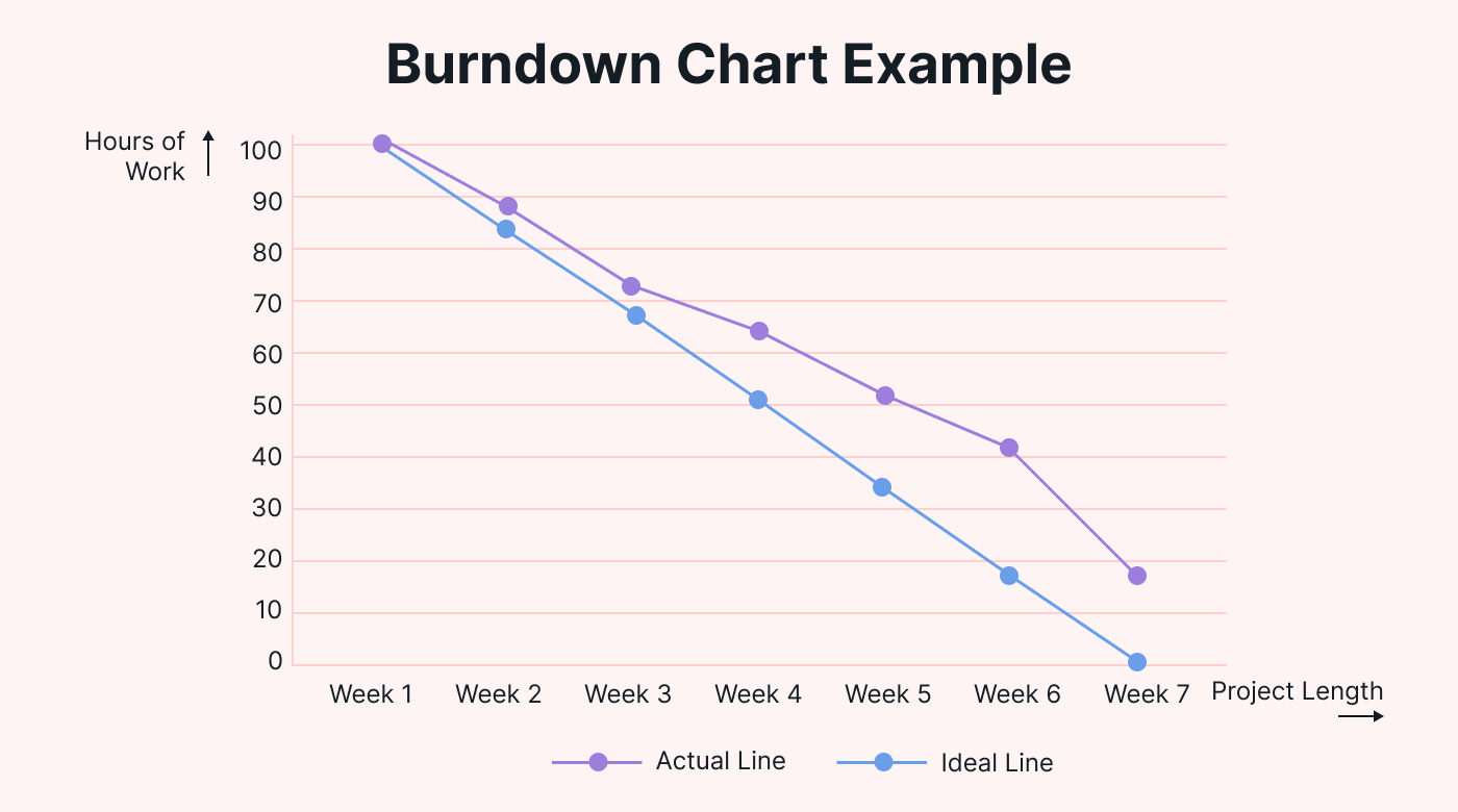 |
A burndown chart is built by plotting tasks or story points you plan to complete against the y-axis.
Then there are two lines:
- The ideal line: This line represents the project’s progression in a perfect world. It’s the consistent pace at which you should complete tasks to finish the project on time.
- The actual line: This line depicts the real-life progress the team makes. Unlike the ideal line, it shows whether the team is ahead, behind, or on schedule.
The surprising versatility of burndown charts
Burndown charts began as a tool primarily for software development teams. The fact that many industries are now using them shows how versatile they are.
Burndown charts are used for the following:
- Marketing campaigns
- Event planning
- Construction
- Manufacturing
- Research and development
An event-planning company could use a burndown chart to track preparations leading up to an event. A manufacturing unit, on the other hand, could use one to plot production targets and actual outputs over a specific timeframe.
Members of the same team can use burndown charts in different ways. Managers typically use them to gain a high-level view of a project’s progress. The rest of the team, however, is typically more concerned with the specific tasks they have left to do.
Types of burndown charts
You may see the following terms in relation to burndown charts:
Agile burndown charts
Agile is an overarching methodology that can include various practices, such as Scrum and Kanban. Agile burndown charts would be any charts used within Agile practices.
Scrum burndown charts
Scrum is a specific approach or tool within an Agile framework. Scrum burndown charts zoom in on cycles or sprints to see how a team is progressing toward its goals.
Sprint burndown charts
This chart is a more focused type that typically provides daily updates on tasks within a sprint. Though it’s related to the others, the key distinction is the frequency of the updates and the granularity of the insights.
Burnup vs. burndown charts
An alternative to a burndown chart is a burnup chart. Instead of focusing on the work left to do, a burnup chart concentrates on the work that’s been completed.
Depending on managerial needs, a burnup or burndown chart might be a better option. If a team needs motivation, a burndown chart can help them focus on the journey ahead. If they’d like to see the progress they’ve already made, a burnup chart can help.
How to create a burndown chart
Now, we’ll discuss the process of creating and interpreting a burndown chart.
Step-by-step guide to making a burndown chart
The creation of a burndown chart is a simple journey, but it requires precision. Let’s break down the steps.
1. Define the timeline
Begin by determining the span of your project. Whether you’re mapping out a week-long sprint or a month-long product launch, this is the amount of time you need to get everything done.
That duration becomes your X-axis.
2. List the required tasks
Figure out the amount of work or number of tasks that you need to complete. List every task within the entire project, along with its estimated completion time.
You could measure that in hours, days, or “story points.”
Story points measure the amount of effort required to complete certain tasks. They account for some tasks having more complexity and uncertainty than others and ultimately offer a more nuanced way of measuring tasks.
The amount of time or story points will become your Y-axis. At the top is where these tasks start. When you reach the bottom, you’ve completed the project.
3. Build the chart
Burndown charts don’t have to be too sophisticated. It’s possible to sketch one manually or use software like Excel.
There are also numerous project management tools that can automate this process.
How to read your chart
Once your chart is ready, it’s time to analyze what you find.
The ideal vs. actual line
As tasks get completed, your “actual” line will begin its descent from the top. Compare this line with the “ideal” line. If your actual line is above the ideal line, that indicates a delay. If it’s below, that means you’re ahead of schedule.
Plateaus and drops
Plateaus in the actual line might indicate a lack of progress or a bottleneck. That could be due to unforeseen challenges or resource constraints.
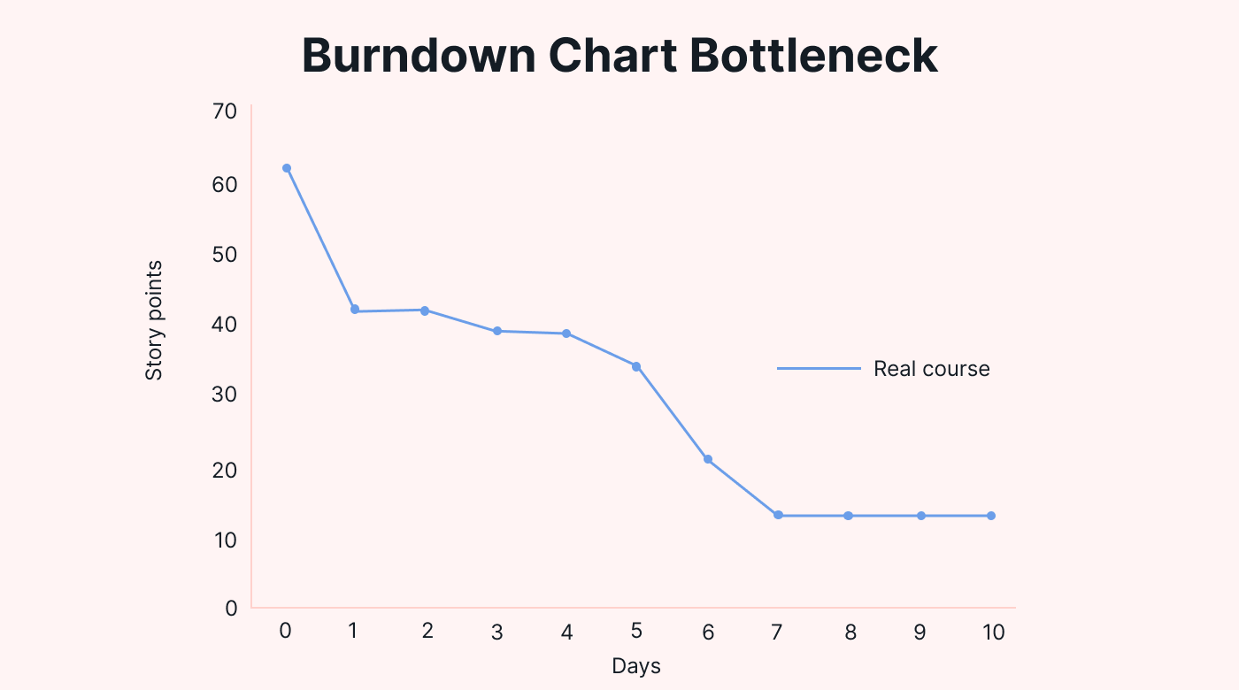 |
A sudden drop, on the other hand, indicates a surge in task completion — often seen after resolving a major hurdle.
Prolonged plateaus or a sudden spike might hint at:
- Team morale issues
- Lack of resources
- External blockers
Managers can use these hints as starting points for open discussions.
Predicting project completion
One of the primary utilities of the burndown chart is its predictive power.
The actual line consistently being above the ideal hints at a possible delay in the project’s completion. This allows managers to recalibrate strategies ahead of time.
The chart can act as a springboard to discuss the “how” of progress. Were there any learning points? Are there processes you could further optimize?
The benefits of using a burndown chart
These graphical representations have many benefits for project teams. Here are the three main ones, along with how using Motion can enhance them:
1. Clarity of project progress
A burndown chart does more than just convey data — it gives you a comprehensive view of a project in one image.
Rather than sifting through spreadsheets or email threads, stakeholders can glance at the chart to check how the project is going.
When you’re in the weeds of your project, a burndown chart is a way to step out and regain clarity. And software like Motion can help you build on that clarity since it lets you dive deeper into the specifics of individual tasks and milestones.
2. Early identification of problems
Spotting problems early on is pivotal, especially for Agile project management. A burndown chart excels in this area.
For instance, a chart that shows recurring delays might convey that more personnel or training may be needed.
Or sometimes, a project’s ambitions might be unrealistic. Here, a burndown chart can offer a reality check. Managers may need to modify the project scope or deadlines to mirror more realistic goals.
If a problem arises early, Motion can help managers pinpoint the task(s) that are causing the issue and determine who or what’s needed to fix it.
3. Better team productivity
Productivity isn’t just about churning out tasks — it’s also about the team being motivated and having a sense of purpose. A burndown chart acts as a tool for inspiration.
The “actual” line in the chart diving below the “ideal” line means the team’s hard work has been acknowledged. And that knowledge keeps them going.
On the other hand, if a project is lagging behind schedule, the team gets a chance to dig deep and catch up or discuss and tackle any hurdles.
Productivity is where Motion truly shines in tandem with a burndown chart. Automating daily planning and rescheduling based on task prioritization can help keep the team on track and focused on what’s most important.
The limitations of using a burndown chart
No tool is without its limitations. Here are the main limitations of burndown charts:
1. Requires accurate estimates
The integrity of a burndown chart leans heavily on the accuracy of your original time and resource estimates.
 |
If you grossly underestimate or overestimate the time or resources needed to complete the project tasks, the chart becomes less effective.
For instance, if a task predicted to take three days actually takes five, the burndown chart becomes less reliable.
2. Oversimplification of complex projects
Burndown charts aren’t great for projects with intricate layers and interconnected tasks.
A chart for a massive project with multiple phases and interdependencies may not reflect what’s actually going on. Seeing an oversimplified view means managers risk ignoring nuances that could influence the project’s outcome.
3. Can lack context
A burndown chart is excellent at showing where things stand in a project. But without a tool like Motion accompanying it, it can fall short of revealing the “why” behind delays or accelerations.
For example, you might see that a project has stalled. But knowing whether the problem is a lack of resources or external factors requires investigation.
4. Potential for misinterpretation
Over-reliance on the chart can result in misled decision-making. Without cross-referencing other tools or insights, managers may misread the graphic.
For example, they might see a plateau and assume it’s due to a lack of effort rather than a challenge.
Top tips for a successful burndown chart
Consider these top tips to maximize the benefits and utility of a burndown chart:
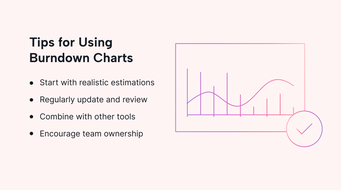 |
1. Start with a realistic estimation
The foundation of an effective chart is an accurate estimation. Rather than making arbitrary guesses, involve your team members in the estimation process since they’re the ones closest to the tasks.
Remember, it’s always a good idea to revisit and adjust estimations as the project progresses.
2. Regularly update and review
To keep the chart relevant, update it consistently — be it daily or weekly. That not only keeps it current but also establishes a rhythm of regular reviews with the team.
This level of consistency will help cultivate a culture of ongoing introspection.
3. Combine with other tools
We mentioned the problems that can arise from over-relying on the burndown chart. The best way to use these charts is to integrate them with other project management tools. That’ll give you a rich, detailed perspective on your project’s progress and challenges.
4. Encourage team ownership
A burndown chart is most effective when the entire team feels a sense of ownership over it. Instead of using it as a tool for blaming, use it as a discussion point to address challenges and celebrate achievements.
Tap into the power of burndown charts with Motion
Burndown charts are an invaluable tool in the dynamic world of project management, as they combine clarity and adaptability.
But any tool is made better when used with the right technology.
With its AI-driven task prioritization and all-in-one project management features, Motion is the perfect partner for your burndown chart.
Motion makes sure projects stay on track and teams stay aligned. Explore its many features with a 7-day free trial.


